

Table of Contents
** Minutes
Remove immediate popups and move newsletter signups closer to the footer
Use ‘Free Shipping’ or ‘Free Gift with Purchase’ promos instead of discounted incentives
Rethink your ‘above the fold’ strategy
Use your top navigation to showcase your products
Enhance social proof including reviews from consumers and publications
Don’t direct shoppers to social media sites (AKA off of your website)
Remove walls of text and replace with bullet points (icons are great too!)
Optimise first for mobile or desktop? Answer: Start with what drives the most revenue
Reorganize your footer content
Use low-intent CTAs to increase engagement
If you ran a brick-and-mortar store, you’d make sure it is aesthetically pleasing and easy for customers to find what they need to make a purchase. The same sentiment applies to your ecommerce website.
Leading ecommerce platforms like Shopify, BigCommerce, Squarespace, and Wix make it easy to launch a beautiful website with little design or web development experience. But an eye-catching website is only half the battle.
Shoppers are looking for something specific that meets their needs, so it’s important to create an online store with a website that showcases your products in the best light. This way, shoppers can easily see the value you provide and feel comfortable to make a purchase on your site.
While BFCM is right around the corner, it doesn’t mean it’s too late to make some last-minute changes to your online store to increase conversions. We hosted a live website teardown webinar with the help of Jon MacDonald, founder and CEO of The Good, an agency that specializes in ecommerce conversion rate optimisation (CRO).
Direct-to-consumer (DTC) brands from a variety of industries walked away with tangible action items that they can easily make to their website right away to increase conversions and maximise sales during BFCM and beyond.
Watch the recording below to view the website teardowns in action, or read on for a list of tips recommended by Jon. This advice is based on thousands of CRO tools, tests, and data collected on what sparks action from shoppers and drives revenue.
Remove immediate popups and move newsletter signups closer to the footer
Imagine walking into a store and you’re met with someone handing you a clipboard and asking for your email address. Potentially off-putting, right?
It’s common to visit an ecommerce site and immediately get hit with a website popup asking for an email to receive a discount. Although they work in building an email list, the quality of the emails collected are generally low. A lot of times, shoppers will either click out or enter their email address just to make the popup go away.
There are a few things that are problematic with offering a percentage or dollar amount discount right off the bat:
- What it communicates to shoppers is that your products are not worth the full price because of the discount you’re giving right away.
- A lot of times, the discount is only shown once in the popup. So if someone initially clicked out to learn more about your products first, they’ll be reluctant to move forward and purchase from you if they can’t locate the discount again.
- Consumers feel good when they know they are getting the best price, so if you show a discount right away and it gets lost, they’ll most likely look somewhere else to find the best offer for a similar product.
Here’s what Jon recommends you do instead:
- Move the email signup box closer to the footer of your homepage and remove the discount incentive.
- Make sure your email signup sets expectations. Clearly state the value of signing up for your newsletter and how often you’ll be emailing them.
- Be sure to include a statement around privacy, which can be as simple as: ‘We will not share consumer data to a third party.”
To get email subscribers, don’t use popups. Instead, build in offers throughout your website that require email for access:
- First to know about new items
- Offers: Free gift with purchase
- Offers: Free shipping
- Offers: VIP access to items
Use ‘Free Shipping’ or ‘Free Gift with Purchase’ promos instead of discounted incentives
If you want to display a promo, adding a sitewide bar at the top of the website and above the navigation is a great tactic. But the only message that has proven to move the needle is around ‘Free Shipping.’ Jon and his team have conducted tons of tests on promo bars and ‘Free Shipping’ has been proven to increase average order value. This type of messaging removes any surprises at checkout and makes the shopper more comfortable to move forward with an intent to purchase.
If you still have message about COVID-19 in your top bar, ditch it. Consumers are tired of reading about it, and now that we’re out of the initial shock of the pandemic, consumers expect you to still be shipping.
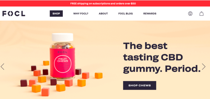
FOCL CBD brand does a great job at promoting ‘Free Shipping’ in a top bar (see below).
Depending on what you sell, another great incentive is ‘Free Gift with Purchase,’ which is used commonly by health, beauty, and wellness brands, but Jon made note that there’s a lot of opportunity for other ecommerce industries to test ‘a free gift’ promo. Offering a free gift can include a new product that you want to test by getting it into your customer’s hands to try.
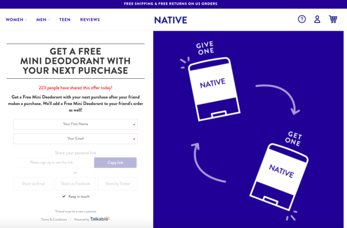
For example, Deodorant brand Native offers a free mini deodorant with your next purchase (see below).
Rethink your ‘above the fold’ strategy
In the past, what mattered most was the content ‘above the fold’ (or what a visitor sees when they land on your site without scrolling), but that’s changed. Thanks to social media feeds, people are used to scrolling.
You don’t need to cram everything above the fold, so don’t be afraid to spread out your messaging and showcase different product categories and the value they offer throughout the homepage.
The only thing you need to include above the fold is your value proposition that communicates what you sell and why. Shoppers want to know what you offer and how it will meet their needs. Everything else can live below the fold including more details and information about your product(s) and social proof.
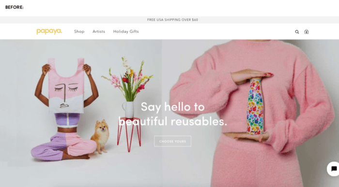
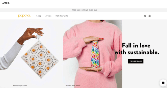
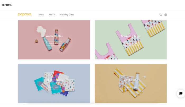
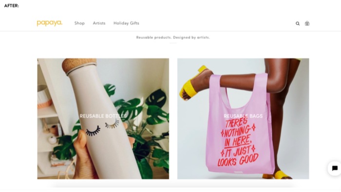
For example, during the live website teardown session, ecommerce brand Papaya Reusables got the following feedback from Jon: “Make sure it’s extremely clear what you’re selling upfront,”so they reevaluated their hero image selection and added callouts to their products over the product images (see below for the before and after photos).
Another mistake brands make is implementing a slider, also known as a ‘carousel,’ instead of a static hero image. This is another attempt to stuff too many messages above the fold at once. Data has proven that less than 1/10 of 1% (as in less than 0.1%) of website visitors will click on a slider CTA.
It can be a frustrating user experience when a visitor hasn’t finished reading something and then it’s gone. Additionally, rotating images can be distracting when the customer is trying to focus on something that is more important. Remove the carousel and stick with a static message that clearly states your value proposition instead.
Use your top navigation to showcase your products
You shouldn’t have more than five navigation links on your site, so it’s important to be thoughtful when organising your items.
One of the biggest mistakes Jon sees brands make is hide their products behind ‘Shop’ in their main navigation. The number one thing a consumer wants to learn more about is your products, so try replacing what’s in your top nav by showcasing your product line.
Brands often have two links that are essentially the same: ‘Shop’ and ‘Products.’ You don’t need both. While not all products can be purchased online, you can always use the product page description to elaborate on where to buy them locally.
That also means removing ‘Blog’ from the top nav. A blog is great for driving top of funnel website traffic and increasing brand awareness, but once a shopper is on your site, they want to know what products you sell. Pushing them to your blog can push them back up the funnel, rather than down.
Here are some other quick fixes to make your website easier for customers to navigate and increase the likelihood that they’ll take action on your site:
- Don’t have ‘New Arrivals’ as its own navigation at the top level, but within each category of product (e.g., Jeans > New Arrivals).
- Move your ‘About Us’ navigation to the footer of your email.
- Never use ‘Home’ in your top navigation. People know to get back to your home screen.
Enhance social proof including reviews from consumers and publications
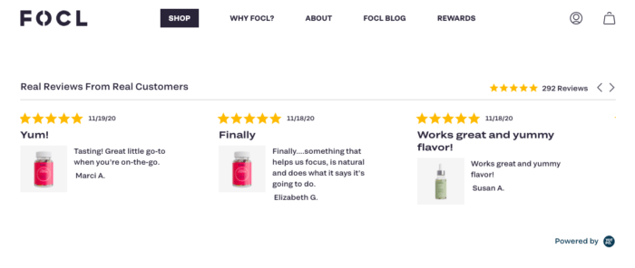
Social proof is very important, but it doesn’t have to be front and centre on your homepage. Make sure all customer reviews include photos of the product(s) that customers are reviewing and link to the product page so people can easily find where to buy the item.
Instead of displaying lengthy reviews, highlight key statements customers have made that emphasize the value of your products. Below is a great example from FOCL (a CBD brand) that showcases their reviews well.
Similarly, for press coverage, logos are great, but a heatmap would show that visitors will try to click on them for more information. Consumers want to know what these publications have said about your products, so add either callout quotes or links to the articles to enhance social proof. Otherwise, they may assume ‘As seen in’ means you just advertised in the publication.
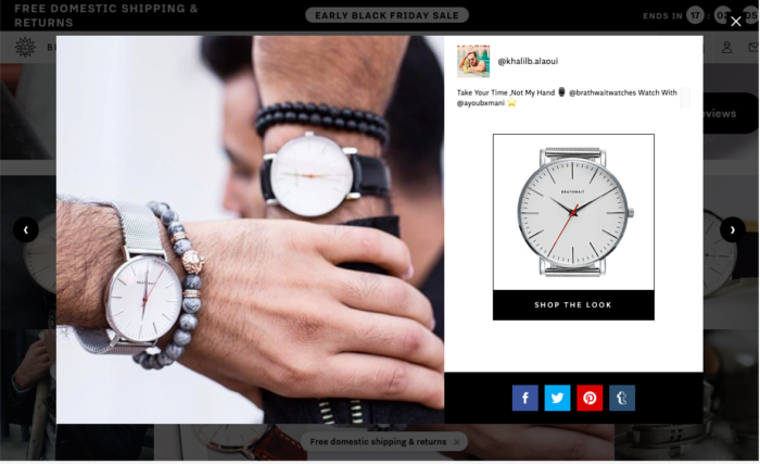
Don’t direct shoppers to social media sites (AKA off of your website)
Social media platforms are a great way to create a community and drive new shoppers to your site. But once shoppers land on your store, directing them back to social media is only going to send them down a black hole, and most likely they won’t come back to make a purchase.
If you are going to embed Instagram social posts (which are great to visually display social proof around products), make sure to include a shopping feature that makes it easy for shoppers to buy directly from Instagram with a ‘Shop the Look’ CTA. Luxury watch brand Brathwait does this well (see below).
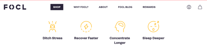
Remove walls of text and replace with bullet points (icons are great too!)
Content is great for SEO, but that doesn’t mean you have to stuff your homepage with long-form content. Instead, move long-form content to your blog and remove paragraphs of text (and fluff) from your home page.
Your homepage should clearly showcase the different products you offer, the value of your products, and the ‘why’ behind your products. You can do this using clear bullet points and even eye-catching icons that highlight the value, features, or differentiators that your products offer.
Optimise first for mobile or desktop? Answer: Start with what drives the most revenue
This is a common website optimisation question, but the answer is quite simple: Optimise for where the most revenue comes from. While more visitors are doing research on mobile (e.g., finding you on social), when shoppers are ready to make a final purchase, desktop continues to trump mobile. It’s still important to make your website responsive and make it easy for people to scroll through your content, since a lot of traffic will come from mobile.
That’s not to say that consumers don’t make online purchase on mobile, but one thing to note is that the higher the price point, the more likely people will purchase on desktop.
Look at the website data using Google Analytics or any other analytics tool to determine where a high percentage of conversions are coming from and start there.
Reorganize your footer content
Jon advises that the two most important things to include in your footer are your products and contact information.
- On the left column, vertically list out your product types or categories.
- On the right side, list a business email address, a physical address (even if it’s a PO box), and a business phone number.
Simply displaying your contact information will dramatically increase trust with new shoppers, even if they’re in a different country than you.
Note: Be sure to separate social from your contact info as this will only direct shoppers to a social feed and discourage shoppers from engaging more with your store.
Use low-intent CTAs to increase engagement
A big CRO mistake that brands make is using high-intent CTAs too soon in the buyer’s journey. If you hit a shopper with a ‘Buy Now’ CTA before they clearly understand what the product is, then they won’t take action. Instead, use a low-intent CTA like ‘View Details’ or ‘Learn More’ to encourage further engagement before directing them to purchase.
Pro tip: Steer clear of CTAs that change colours when someone scrolls over the button as this functionality doesn’t work on mobile. This is an easy fix that Papaya Reusables was able to make right away (see below for the before and after photos).
Remove any surprises at checkout
Throughout your homepage and product pages, add content that helps to reduce any surprises at checkout. Another reason why stating ‘Free Shipping’ in your top nav bar works so well is that it eliminates surprise shipping costs at checkout.
Many times, an online store will include an FAQs page, which is usually stuffed with useful content, but Jon bluntly calls these pages ‘where good content goes to die.’ Instead, answer commonly asked questions throughout your pages and where it makes the most sense. For instance, you can add a blurb about your ecommerce returns and exchange policy on a product page so shoppers feel more comfortable to push forward with a purchase.
Conclusion
Taking the time to make small changes to optimise your website can easily reduce cart abandonment and increase sales — especially for the holiday shopping season. There are several optimisation tools and solutions you can try to help you optimise your website based on user behaviour. Or, you can work with the experts at The Good by requesting a free landing page teardown here.
Your online store might be beautiful, but the goal is to engage shoppers, build trust with them, and encourage them to make a purchase. These simple website fixes can easily be made before BCFM to drive more sales.
If you’re looking for help on fulfilling a high volume of holiday orders, it’s not too late to get started with ShipBob. Learn more about ShipBob works and request custom pricing by clicking the button below.


