
Table of Contents
** Minutes
2. Make it mobile- and desktop-friendly
3. Make it simple for the user
“Simplicity is the ultimate sophistication,” wrote Leonardo da Vinci in the fifteenth century. Simplicity has been a constant theme for many great thinkers throughout history, and the principle is no truer than in the constantly evolving technology landscape we see today.
Don’t be fooled: simple doesn’t mean taking the easy route. Thinking and acting simply can help you spend your time more efficiently. For you, this might be simplifying your day-to-day tasks, making it easier and less time consuming to be creative. Or maybe it’s making sure what you create is easy for others to use, limiting any confusion, stress, delay, or distractions.
As marketers, we strive to deliver slick emails with gripping copy and intelligent personalisation but overcomplicating this can mean that your message is lost on the consumer entirely. This is particularly true on mobile devices.
47% of emails are opened on mobile devices or business phone apps, and conversion rates on mobile are up 64% compared to desktops, according to dotdigital’s research on our recipients. If your emails aren’t optimised for mobile, you’re missing out big-time.
Here are five super simple steps you can adopt today to start creating engaging campaigns that really convert. So, think big but start small: Implement today and enhance your email design straight away.
1. Minimalism is key
Time is essential. As marketers, we don’t have enough, and as consumers, we don’t want it wasted.
On average, people spend 12 seconds looking at an email. In that small window, your email can be closed, swiped, or deleted before your content has even been processed.
How do you get around this?
Be attention-grabbing, concise, and straight to the point. You’ve only got a few seconds, so the easier your content is to digest, the bigger the impact you’ll have.
All essential and relevant info needs to be made clear immediately. Make it easy for them to engage, scroll down, read more, or click through.
If imagery is the route you take, think about how to grab the reader’s attention. A good picture can paint a thousand words or stop your readers in their tracks. Remember to keep the copy is short, and your key messages obvious.
The easier it is for the brain to take in, the longer lasting your impact will be.
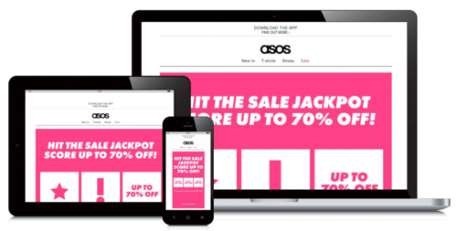
2. Make it mobile- and desktop-friendly
Every customer is different. They’re opening emails on different devices, at different times of the day, and with different intentions. Email providers for desktop and mobile have different hoops and hurdles you have to overcome to successfully get your message across. The more simplistic your style, content, and layout, the easier it’ll be for your email to display correctly.
Achieving simplicity isn’t just about being minimal with your creative. It helps if your branding is simple, clean, and clutter free, but don’t force your brand into a style that feels disjointed, and make sure you create a design checklist.
Think window display, not the shop itself. Reduce the clutter; strip back and streamline your content.
Emails with too many links and images or too much copy are hard for email providers to process. Give customers a glimpse through the window, rather than a look at the whole shop. Select a few things that will appeal most to your customers and make your CTAs obvious and easy to find.
Depending on where your emails are being read — on desktop, webmail, or mobile — images might be automatically hidden, or they could just fail to load because of a poor connection. Create your emails with this in mind. Use background colours to define specific areas and use of alt text to make your message clear even with images turned off.
3. Make it simple for the user
Some lucky desktop users might have a preview window to get a sneak peek at your email but, most of the time, they’ll have to open your email to see it. And so your 12-second countdown begins. This is your prime real-estate, your ‘above the fold’ content; the only part of your email many readers will see.
It’s important to plan what’s going to be shown here. Space is a luxury, so cut down where you can. Think about the smallest details. Does your logo need to be that big? It should be clear in the inbox who the email’s from. These things make a big difference.
80% of readers’ time is spent on above-the-fold content, so make sure you place your CTAs or key messages there and set up your alt text for those users who can’t or choose not to load images.
Make sure it’s easy for customers to do what you want them to. If you feature a new t-shirt, link to the product page. New menu? Send them to that page on your site. Instead of losing customers to endless hours of cat videos on YouTube, host your videos on an optimised landing page and send them on to your website from there.
If you can hook them with your ‘above the fold’ content, they’re more than likely to scroll to the bottom, so close off your email with another CTA to visit your site.
4. Less is often more
When possible, try to reduce content. We’ve all heard that “less is more,” but so few of us put it into practice.
Reports from your old campaigns come in handy when figuring out what can be cut. Check out when and on what device subscribers are opening your emails. If they’re opening them at 8 am on a mobile device, then they’re probably looking at them on
the train or bus to work. They’re likely scrolling with one hand, so less copy, bigger graphics, and clear CTAs are essential. On the other hand, if they’re opening them on tablets and desktops, then you have more space to play with.
Optimising content for mobile is super simple with the dotmailer platform. By hiding certain parts of your content, you can reduce a long section of copy to a simple link or a single paragraph.
Your content should be inspiring. Don’t overthink it. Inspiring content doesn’t have to be long, complex or fancy. Once again, less is more. Start by looking at what’s around you, what you sell, or what service you provide. Take the ordinary and twist it — make it different and get people’s attention. Think about the actions you want to inspire. You can even create a sense of urgency by using countdown clocks and approaching deadlines.
5. The simplest touches make the biggest difference
The big difference between an email that looks budget and one that looks premium is far simpler than you think. The answer: padding, space, and an uncluttered layout.
An uncluttered layout: Utilising white space makes it easier for the brain to differentiate what it’s seeing and take in information. Just like an art gallery, adding space and reducing items can make a huge impact on the overall feel of the email. Adding simple graphics or subtle dividers between content can help the user digest each item with ease.
With screen resolutions on smartphones, desktops, iPads, and tablets constantly improving, it’s important to make sure your images are going to work in your email. High-resolution images are more adaptive, meaning they’re optimised no matter the screen size. The higher the quality of your images and graphics the higher the quality of your email.
Final thoughts
With technology constantly advancing and customers becoming even more difficult to pin down, brands must be agile to keep audiences engaged. Put yourself in the customer’s shoes —we’re all consumers at the end of the day) — and figure out what they need and when they need it. Then plan every step of their journey.
In the words of Steve Jobs: “You have to work hard to get your thinking clean and make it simple. But it’s worth it in the end.”
Get started with ShipBob
Interested in learning more about ShipBob? Ready to partner with a 3PL? Request a quote below to connect with the ShipBob team.